OVERVIEW
Designing clarity for AI-powered bug tracking
Designing clarity for AI-powered bug tracking
Designing clarity for AI-powered bug tracking
A clearer way for teams to find projects, report issues, and keep quality work moving across a complex product workspace.
A clearer way for teams to find projects, report issues, and keep quality work moving across a complex product workspace.
A clearer way for teams to find projects, report issues, and keep quality work moving across a complex product workspace.
ROLE
Product Designer
COMPANY
Moolya
FOCUS
UX / UI design
YEAR
2022

01 / OVERVIEW
The product, at a glance
The product, at a glance
The product, at a glance
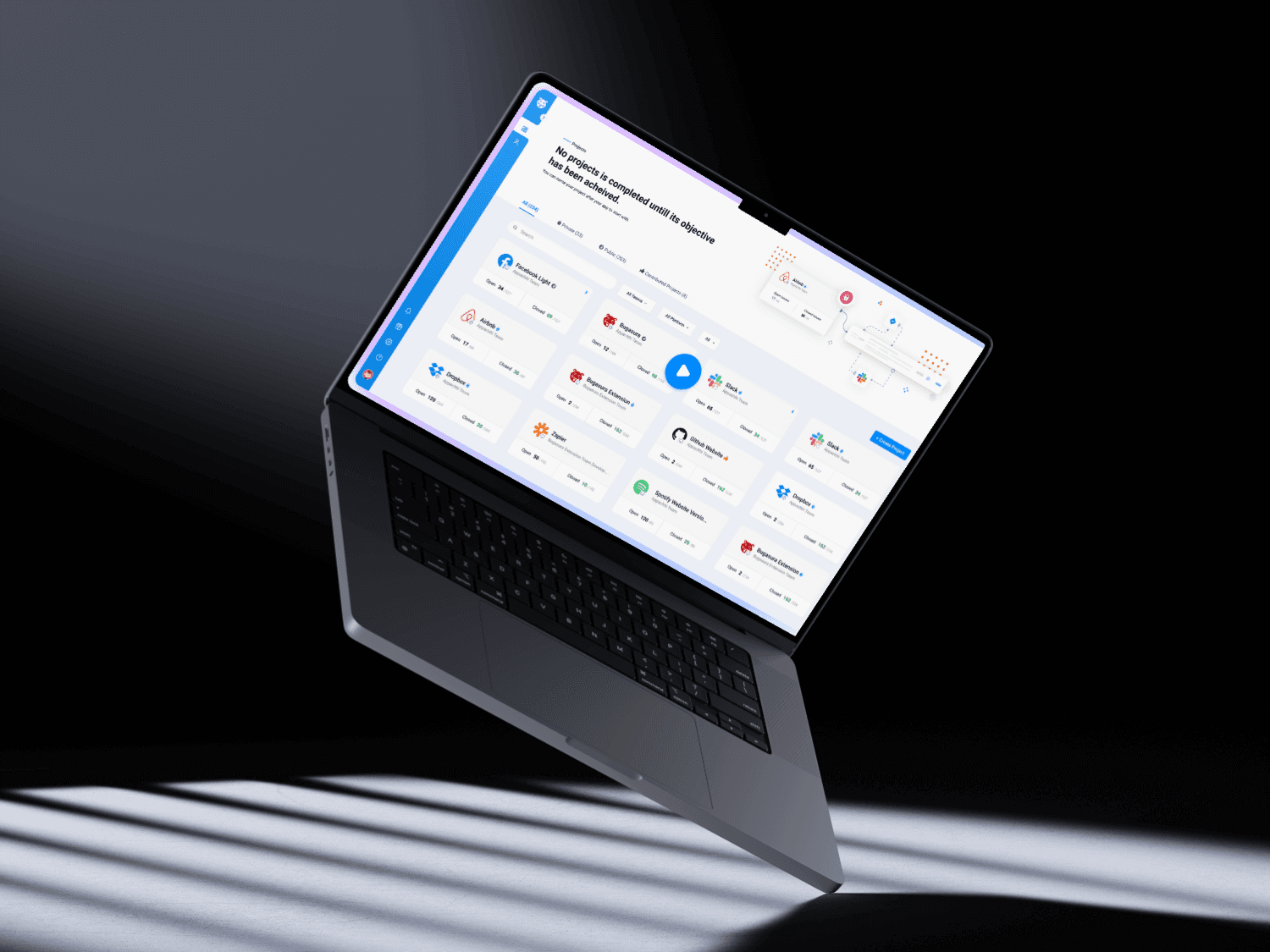
Bugasura is a workspace for tracking software issues and coordinating quality work. Teams need to move between projects, understand what needs attention, and document a bug clearly enough for someone else to act on it. My 2022 product-design work focused on making those core paths easier to understand and use. This case study examines the decisions visible in the portfolio and design archive; it does not claim a full product launch or a quantified business result.
Bugasura is a workspace for tracking software issues and coordinating quality work. Teams need to move between projects, understand what needs attention, and document a bug clearly enough for someone else to act on it. My 2022 product-design work focused on making those core paths easier to understand and use. This case study examines the decisions visible in the portfolio and design archive; it does not claim a full product launch or a quantified business result.
Bugasura is a workspace for tracking software issues and coordinating quality work. Teams need to move between projects, understand what needs attention, and document a bug clearly enough for someone else to act on it. My 2022 product-design work focused on making those core paths easier to understand and use. This case study examines the decisions visible in the portfolio and design archive; it does not claim a full product launch or a quantified business result.
02 / CONTEXT
A busy workspace needs a clear starting point
A busy workspace needs a clear starting point
A busy workspace needs a clear starting point
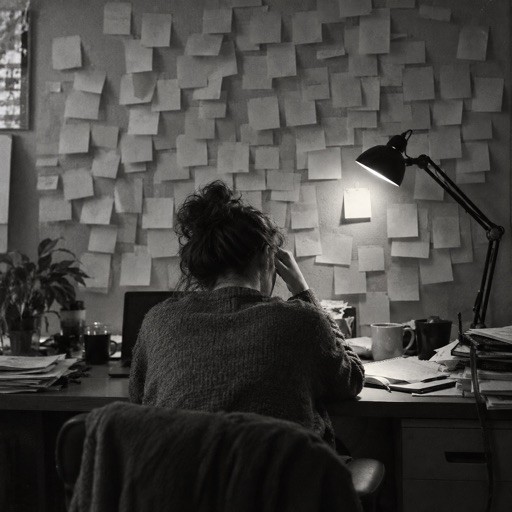
Bug tracking is already cognitively demanding: a person must know where they are, what an issue means, who owns it, and what happens next. When project navigation, filters, and reporting controls compete for attention, the interface adds another layer of work. The design opportunity was to make the project overview a dependable home base: a place to find the right project quickly, scan its status, and move into issue work with confidence.
Bug tracking is already cognitively demanding: a person must know where they are, what an issue means, who owns it, and what happens next. When project navigation, filters, and reporting controls compete for attention, the interface adds another layer of work. The design opportunity was to make the project overview a dependable home base: a place to find the right project quickly, scan its status, and move into issue work with confidence.
Bug tracking is already cognitively demanding: a person must know where they are, what an issue means, who owns it, and what happens next. When project navigation, filters, and reporting controls compete for attention, the interface adds another layer of work. The design opportunity was to make the project overview a dependable home base: a place to find the right project quickly, scan its status, and move into issue work with confidence.

03 / DESIGN PRIORITIES
What the interface needed to do
What the interface needed to do
What the interface needed to do
The work can be understood through three priorities: orient people before asking them to act; make frequent tasks—finding a project, narrowing a list, and opening an issue—feel direct; and keep information structured enough for handoff between testers, developers, and other teammates. These are design objectives inferred from the visible screens and current case-study narrative, not measured success criteria.
The work can be understood through three priorities: orient people before asking them to act; make frequent tasks—finding a project, narrowing a list, and opening an issue—feel direct; and keep information structured enough for handoff between testers, developers, and other teammates. These are design objectives inferred from the visible screens and current case-study narrative, not measured success criteria.
The work can be understood through three priorities: orient people before asking them to act; make frequent tasks—finding a project, narrowing a list, and opening an issue—feel direct; and keep information structured enough for handoff between testers, developers, and other teammates. These are design objectives inferred from the visible screens and current case-study narrative, not measured success criteria.
01
Find the right place
Project groupings and filters help reduce the search space.
02
See what matters
Clear summaries make the next action easier to identify.
03
Hand off with clarity
Issue details should carry enough context for another person to act.

04 / APPROACH
Organize first. Then reveal detail.
Organize first. Then reveal detail.
Organize first. Then reveal detail.
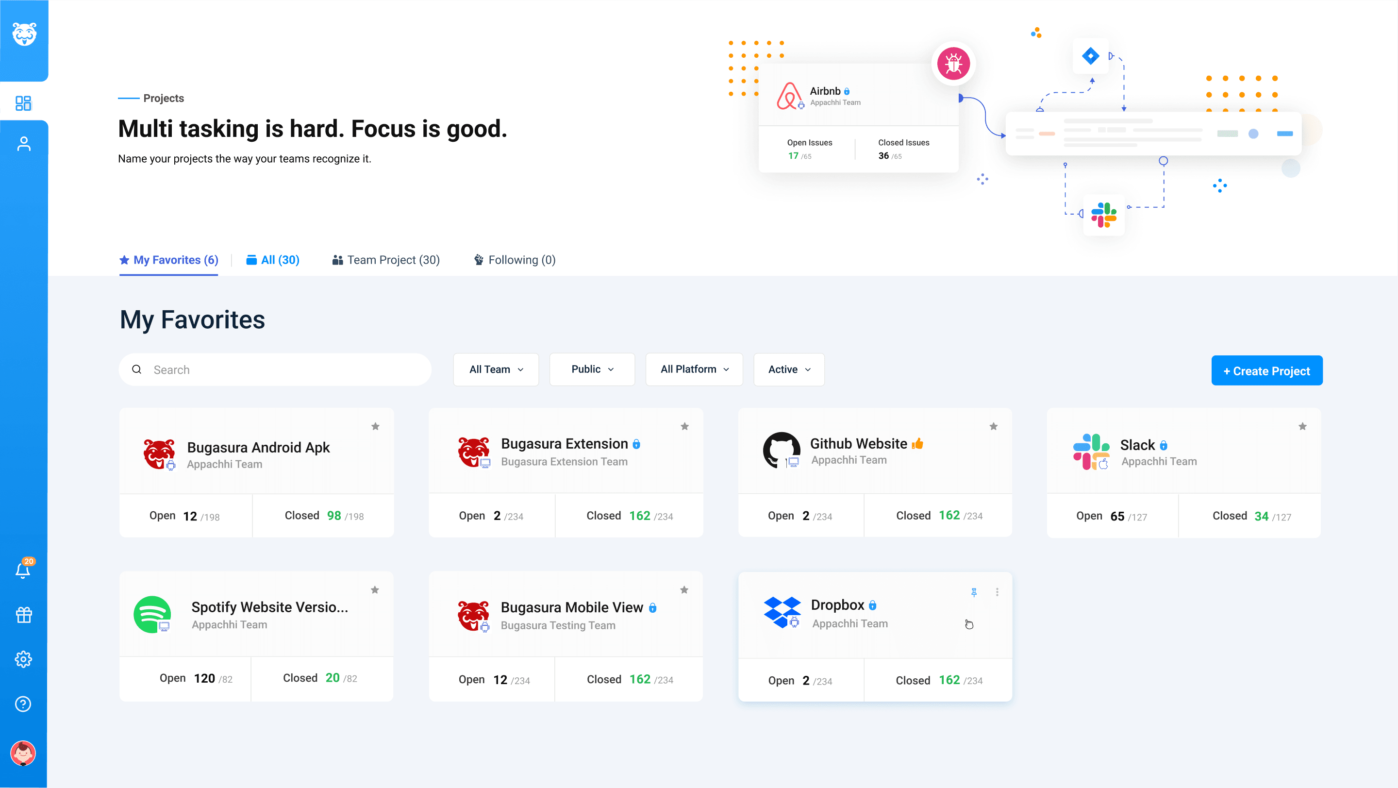
The project overview uses recognizable categories—favorites, all projects, team-owned work, and followed work—to give people more than one route to the same destination. A search field and filters support targeted retrieval, while project cards keep scanning lightweight. This hierarchy matters because people arrive with different mental models: some remember a project name, others know the team or status. The interface meets them at either starting point.
The project overview uses recognizable categories—favorites, all projects, team-owned work, and followed work—to give people more than one route to the same destination. A search field and filters support targeted retrieval, while project cards keep scanning lightweight. This hierarchy matters because people arrive with different mental models: some remember a project name, others know the team or status. The interface meets them at either starting point.
The project overview uses recognizable categories—favorites, all projects, team-owned work, and followed work—to give people more than one route to the same destination. A search field and filters support targeted retrieval, while project cards keep scanning lightweight. This hierarchy matters because people arrive with different mental models: some remember a project name, others know the team or status. The interface meets them at either starting point.
Project overview · categories, search, filters, and scannable project cards
Project overview · categories, search, filters, and scannable project cards
Project overview · categories, search, filters, and scannable project cards

05 / DESIGN DECISIONS
The small choices that reduce friction
The small choices that reduce friction
The small choices that reduce friction
The screen combines a stable navigation rail with a focused main canvas. Counts near category labels show the scale of each view before opening it. Search and filters sit near the content they control. Project cards expose a compact summary instead of forcing a visit to every project for basic orientation. In the broader design archive, adjacent explorations cover issue creation, project settings, integrations, notifications, and reporting—evidence that the product had to support an end-to-end workflow, not just an attractive dashboard.
The screen combines a stable navigation rail with a focused main canvas. Counts near category labels show the scale of each view before opening it. Search and filters sit near the content they control. Project cards expose a compact summary instead of forcing a visit to every project for basic orientation. In the broader design archive, adjacent explorations cover issue creation, project settings, integrations, notifications, and reporting—evidence that the product had to support an end-to-end workflow, not just an attractive dashboard.
The screen combines a stable navigation rail with a focused main canvas. Counts near category labels show the scale of each view before opening it. Search and filters sit near the content they control. Project cards expose a compact summary instead of forcing a visit to every project for basic orientation. In the broader design archive, adjacent explorations cover issue creation, project settings, integrations, notifications, and reporting—evidence that the product had to support an end-to-end workflow, not just an attractive dashboard.

06 / MY CONTRIBUTION
From structure to usable screens
From structure to usable screens
From structure to usable screens
The existing portfolio identifies my role as Product Designer at Moolya in 2022, focused on UX/UI design. The work presented here is the interface and workflow design visible in the supplied case-study assets and design file: organizing the project entry point, clarifying information hierarchy, and exploring connected flows such as issue and integration management. I have not attributed engineering, research sample sizes, or later product features to this project without source evidence.
The existing portfolio identifies my role as Product Designer at Moolya in 2022, focused on UX/UI design. The work presented here is the interface and workflow design visible in the supplied case-study assets and design file: organizing the project entry point, clarifying information hierarchy, and exploring connected flows such as issue and integration management. I have not attributed engineering, research sample sizes, or later product features to this project without source evidence.
The existing portfolio identifies my role as Product Designer at Moolya in 2022, focused on UX/UI design. The work presented here is the interface and workflow design visible in the supplied case-study assets and design file: organizing the project entry point, clarifying information hierarchy, and exploring connected flows such as issue and integration management. I have not attributed engineering, research sample sizes, or later product features to this project without source evidence.

07 / OUTCOMES
What the design delivered
What the design delivered
What the design delivered
The available screens show a more legible project workspace and a consistent direction for complex bug-management tasks. They do not show analytics or a before-and-after usability study, so the honest outcome is a design deliverable: a clearer structure and visual system for the product team to develop and evaluate. The lesson I carry forward is that in workflow-heavy tools, clarity is not decoration. It comes from making location, priority, and next action visible at the moment a person needs them.
The available screens show a more legible project workspace and a consistent direction for complex bug-management tasks. They do not show analytics or a before-and-after usability study, so the honest outcome is a design deliverable: a clearer structure and visual system for the product team to develop and evaluate. The lesson I carry forward is that in workflow-heavy tools, clarity is not decoration. It comes from making location, priority, and next action visible at the moment a person needs them.
The available screens show a more legible project workspace and a consistent direction for complex bug-management tasks. They do not show analytics or a before-and-after usability study, so the honest outcome is a design deliverable: a clearer structure and visual system for the product team to develop and evaluate. The lesson I carry forward is that in workflow-heavy tools, clarity is not decoration. It comes from making location, priority, and next action visible at the moment a person needs them.

REFLECTION
Clarity is a product feature.
Clarity is a product feature.
Clarity is a product feature.
In workflow-heavy software, visual polish is only useful when it helps someone make a decision. This project reinforced the value of showing where a person is, what needs attention, and what action comes next—without asking them to decode the interface first.
In workflow-heavy software, visual polish is only useful when it helps someone make a decision. This project reinforced the value of showing where a person is, what needs attention, and what action comes next—without asking them to decode the interface first.
In workflow-heavy software, visual polish is only useful when it helps someone make a decision. This project reinforced the value of showing where a person is, what needs attention, and what action comes next—without asking them to decode the interface first.
THAT’S THE STORY
Good tools make the hard work feel simpler.
Good tools make the hard work feel simpler.
Good tools make the hard work feel simpler.
KEEP EXPLORING
More work to explore.
More work to explore.
01 / YOU’RE HERE
Bugasura
Product design
A clearer way for teams to track and resolve bugs.
↗
02 /
My ESG Planet
Enterprise UX
Making complex ESG reporting easier to navigate.
↗
03 /
Blueberry
AI product design
Making AI work visible, reviewable, and safe.
↗
04 /
Delicacy
Mobile experience
Making balanced meal planning feel simpler.
↗
Let’s make something worth remembering.
Let’s make something worth remembering.
Amal brings the ideas, the craft, and the obsessive attention to detail. I bring moral support and occasional interruptions. Between us, you’re in good hands.
Amal brings the ideas, the craft, and the obsessive attention to detail. I bring moral support and occasional interruptions. Between us, you’re in good hands.
© 2026 Amal K Saji · Designed with care. Supervised by Luca.