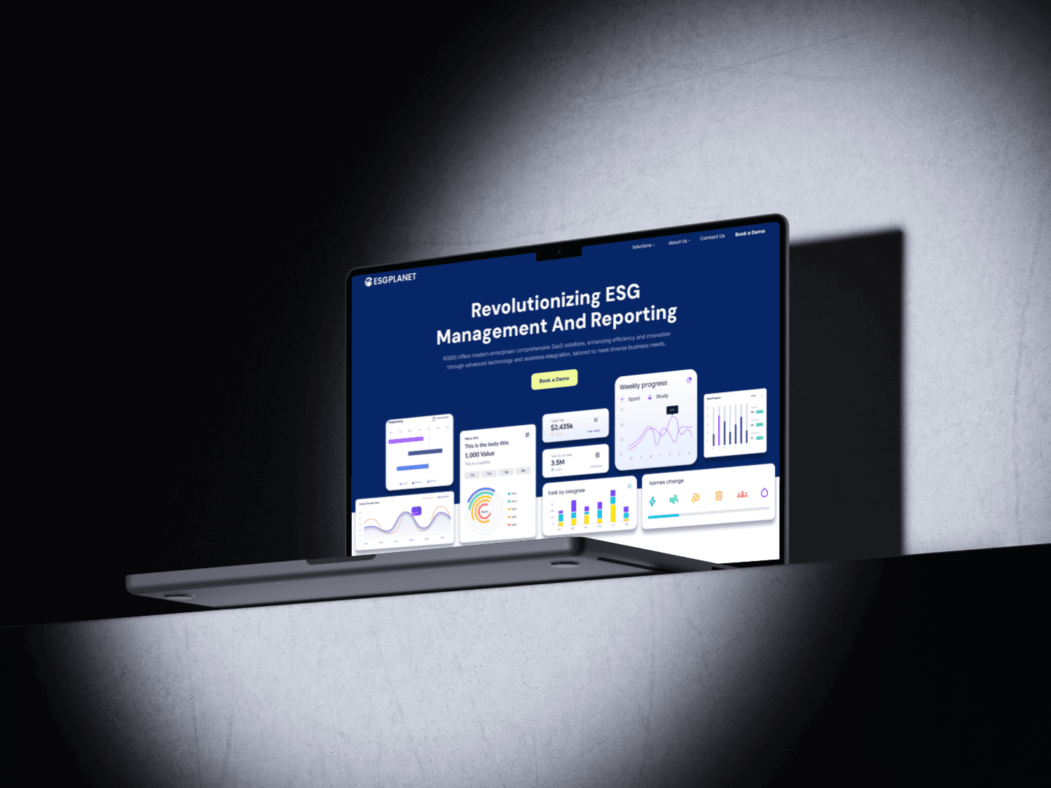
OVERVIEW
Making enterprise ESG reporting easier to navigate.
Making enterprise ESG reporting easier to navigate.
Making enterprise ESG reporting easier to navigate.
A connected experience for collecting, reviewing, comparing, and reporting complex sustainability data with the context teams need to trust it.
A connected experience for collecting, reviewing, comparing, and reporting complex sustainability data with the context teams need to trust it.
ROLE
Design Lead
COMPANY
RGBSI
FOCUS
Product Design
YEAR
2026

01 / OVERVIEW
One place for a broad reporting domain
One place for a broad reporting domain
One place for a broad reporting domain
My ESG Planet brings environmental, social, and governance work into one enterprise platform. Sustainability teams must track emissions, energy, water, workforce measures, approvals, and reporting periods—often across facilities and financial years. The design direction organizes that breadth into a coherent workflow, so a user can start with a progress summary and follow the evidence down to a particular indicator. The project presented here is the product-design work for RGBSI; no quantified adoption or performance claim is implied.
My ESG Planet brings environmental, social, and governance work into one enterprise platform. Sustainability teams must track emissions, energy, water, workforce measures, approvals, and reporting periods—often across facilities and financial years. The design direction organizes that breadth into a coherent workflow, so a user can start with a progress summary and follow the evidence down to a particular indicator. The project presented here is the product-design work for RGBSI; no quantified adoption or performance claim is implied.
My ESG Planet brings environmental, social, and governance work into one enterprise platform. Sustainability teams must track emissions, energy, water, workforce measures, approvals, and reporting periods—often across facilities and financial years. The design direction organizes that breadth into a coherent workflow, so a user can start with a progress summary and follow the evidence down to a particular indicator. The project presented here is the product-design work for RGBSI; no quantified adoption or performance claim is implied.

02 / CONTEXT
Complex data needs its context attached
Complex data needs its context attached
Complex data needs its context attached
An ESG value is only useful when the reader knows what it measures, its unit, the organization or facility it belongs to, and the period it covers. Those details can be lost when data moves between dashboards, approval queues, and report exports. The interface therefore has to support two modes at once: a quick scan for progress and exceptions, and a traceable path into the underlying measure when a reviewer needs to check or approve it.
An ESG value is only useful when the reader knows what it measures, its unit, the organization or facility it belongs to, and the period it covers. Those details can be lost when data moves between dashboards, approval queues, and report exports. The interface therefore has to support two modes at once: a quick scan for progress and exceptions, and a traceable path into the underlying measure when a reviewer needs to check or approve it.
An ESG value is only useful when the reader knows what it measures, its unit, the organization or facility it belongs to, and the period it covers. Those details can be lost when data moves between dashboards, approval queues, and report exports. The interface therefore has to support two modes at once: a quick scan for progress and exceptions, and a traceable path into the underlying measure when a reviewer needs to check or approve it.

03 / DESIGN PRIORITIES
Make progress, gaps, and evidence visible
Make progress, gaps, and evidence visible
Make progress, gaps, and evidence visible
The design priorities were to keep financial-year and organization context visible; distinguish Environment, Social, and Governance without turning them into disconnected products; and let reviewers move from an overview to the exact metric or submission requiring attention. These are design goals grounded in the existing project narrative and screens, not claims of measured improvement.
The design priorities were to keep financial-year and organization context visible; distinguish Environment, Social, and Governance without turning them into disconnected products; and let reviewers move from an overview to the exact metric or submission requiring attention. These are design goals grounded in the existing project narrative and screens, not claims of measured improvement.
The design priorities were to keep financial-year and organization context visible; distinguish Environment, Social, and Governance without turning them into disconnected products; and let reviewers move from an overview to the exact metric or submission requiring attention. These are design goals grounded in the existing project narrative and screens, not claims of measured improvement.
01
Keep context present
Year, facility, units, and pillar travel with the data rather than hiding in a separate setting.
02
Reveal exceptions
Progress, alerts, and pending approvals surface what needs review next.
03
Support reporting
Detailed views retain the evidence and publication information needed for formal output.

04 / APPROACH
Design from the reporting model outward
Design from the reporting model outward
Design from the reporting model outward
I first structured the information around financial year, organization or facility, and ESG pillar. Environmental measures branch into Scope 1, 2, and 3 emissions, offsets, energy intensity, and water indicators; Social groups workforce, attrition, benefits, complaints, and incidents. Only after that hierarchy was clear did the dashboard pattern take shape. Summary cards help people orient; comparison views and charts support deeper review; logs and approvals stay near the data they govern.
I first structured the information around financial year, organization or facility, and ESG pillar. Environmental measures branch into Scope 1, 2, and 3 emissions, offsets, energy intensity, and water indicators; Social groups workforce, attrition, benefits, complaints, and incidents. Only after that hierarchy was clear did the dashboard pattern take shape. Summary cards help people orient; comparison views and charts support deeper review; logs and approvals stay near the data they govern.
I first structured the information around financial year, organization or facility, and ESG pillar. Environmental measures branch into Scope 1, 2, and 3 emissions, offsets, energy intensity, and water indicators; Social groups workforce, attrition, benefits, complaints, and incidents. Only after that hierarchy was clear did the dashboard pattern take shape. Summary cards help people orient; comparison views and charts support deeper review; logs and approvals stay near the data they govern.
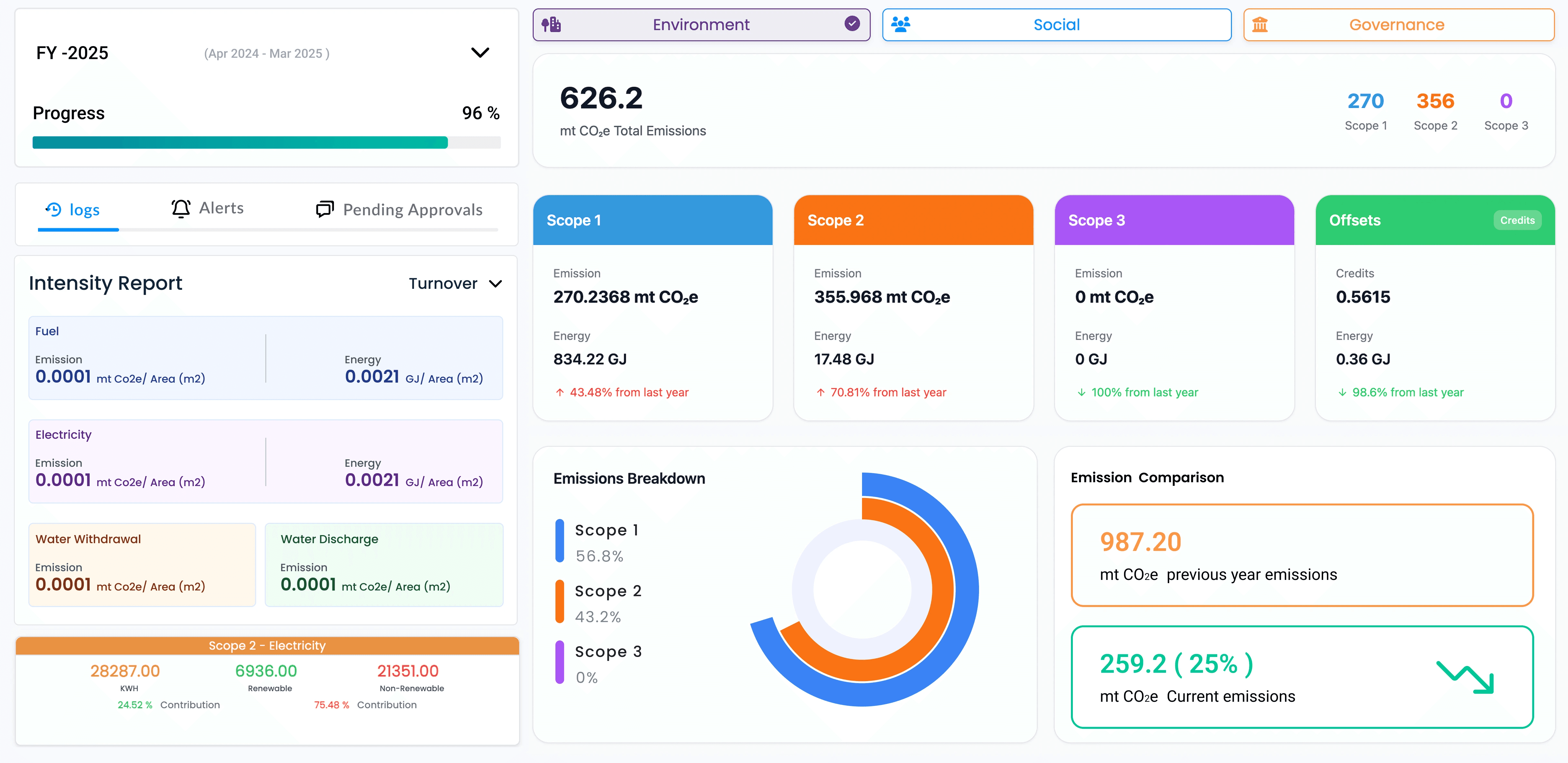
Environmental dashboard · period progress, emissions scopes, intensity measures, and comparisons
Environmental dashboard · period progress, emissions scopes, intensity measures, and comparisons

05 / SYSTEM
One visual language across different measures
One visual language across different measures
One visual language across different measures
The dashboard pairs high-level progress with more precise reporting modules. Scope cards preserve units and year-over-year direction; intensity panels make unlike measures easier to compare without flattening them into one score. Color groups the reporting categories, while repeated card, filter, and chart patterns make a broad domain feel learnable. Social views reuse that grammar for workforce and incident indicators rather than inventing a new interface for every pillar.
The dashboard pairs high-level progress with more precise reporting modules. Scope cards preserve units and year-over-year direction; intensity panels make unlike measures easier to compare without flattening them into one score. Color groups the reporting categories, while repeated card, filter, and chart patterns make a broad domain feel learnable. Social views reuse that grammar for workforce and incident indicators rather than inventing a new interface for every pillar.
The dashboard pairs high-level progress with more precise reporting modules. Scope cards preserve units and year-over-year direction; intensity panels make unlike measures easier to compare without flattening them into one score. Color groups the reporting categories, while repeated card, filter, and chart patterns make a broad domain feel learnable. Social views reuse that grammar for workforce and incident indicators rather than inventing a new interface for every pillar.

06 / MY ROLE
Leading the structure and product language
Leading the structure and product language
Leading the structure and product language
As Design Lead, I shaped the information architecture, dashboard hierarchy, reporting patterns, and visual system. The work connected environmental and social workflows while keeping key context—metrics, units, dates, organization, and export actions—consistent. The screens represent a product direction and design deliverables; the available material does not establish a verified launch result, user-study sample, or business impact figure.
As Design Lead, I shaped the information architecture, dashboard hierarchy, reporting patterns, and visual system. The work connected environmental and social workflows while keeping key context—metrics, units, dates, organization, and export actions—consistent. The screens represent a product direction and design deliverables; the available material does not establish a verified launch result, user-study sample, or business impact figure.
As Design Lead, I shaped the information architecture, dashboard hierarchy, reporting patterns, and visual system. The work connected environmental and social workflows while keeping key context—metrics, units, dates, organization, and export actions—consistent. The screens represent a product direction and design deliverables; the available material does not establish a verified launch result, user-study sample, or business impact figure.

07 / OUTCOMES
A more coherent reporting workflow
A more coherent reporting workflow
A more coherent reporting workflow
The design brings collection, monitoring, comparison, approvals, and reporting into a connected experience. It gives teams a shared view of progress while preserving the detailed evidence needed for review. The visible outcome is a reusable interface direction: the same hierarchy can accommodate additional ESG measures without fragmenting navigation or making every new report feel like a separate tool.
The design brings collection, monitoring, comparison, approvals, and reporting into a connected experience. It gives teams a shared view of progress while preserving the detailed evidence needed for review. The visible outcome is a reusable interface direction: the same hierarchy can accommodate additional ESG measures without fragmenting navigation or making every new report feel like a separate tool.
The design brings collection, monitoring, comparison, approvals, and reporting into a connected experience. It gives teams a shared view of progress while preserving the detailed evidence needed for review. The visible outcome is a reusable interface direction: the same hierarchy can accommodate additional ESG measures without fragmenting navigation or making every new report feel like a separate tool.

REFLECTION
A dashboard should answer a task.
A dashboard should answer a task.
A dashboard should answer a task.
Enterprise reporting is not made useful by adding more charts. Each view needs to help someone monitor progress, find an exception, compare periods, approve data, or prepare a report. This project reinforced that clear context and traceability matter as much as visual simplicity.
Enterprise reporting is not made useful by adding more charts. Each view needs to help someone monitor progress, find an exception, compare periods, approve data, or prepare a report. This project reinforced that clear context and traceability matter as much as visual simplicity.
Enterprise reporting is not made useful by adding more charts. Each view needs to help someone monitor progress, find an exception, compare periods, approve data, or prepare a report. This project reinforced that clear context and traceability matter as much as visual simplicity.
THAT’S THE STORY
Make complex reporting feel accountable.
Make complex reporting feel accountable.
Make complex reporting feel accountable.
KEEP EXPLORING
More work to explore.
More work to explore.
01 /
Bugasura
Product design
A clearer way for teams to track and resolve bugs.
↗
02 / YOU’RE HERE
My ESG Planet
Enterprise UX
Making complex ESG reporting easier to navigate.
↗
03 /
Blueberry
AI product design
Making AI work visible, reviewable, and safe.
↗
04 /
Delicacy
Mobile experience
Making balanced meal planning feel simpler.
↗
Let’s make something worth remembering.
Let’s make something worth remembering.
Amal brings the ideas, the craft, and the obsessive attention to detail. I bring moral support and occasional interruptions. Between us, you’re in good hands.
Amal brings the ideas, the craft, and the obsessive attention to detail. I bring moral support and occasional interruptions. Between us, you’re in good hands.
© 2026 Amal K Saji · Designed with care. Supervised by Luca.