BUGASURA
Designing Clarity for AI-Powered Bug Tracking
COMPANY
Moolya
ROLE
Product Designer
EXPERTISE
UX/UI Design
YEAR
2022
Project Overview
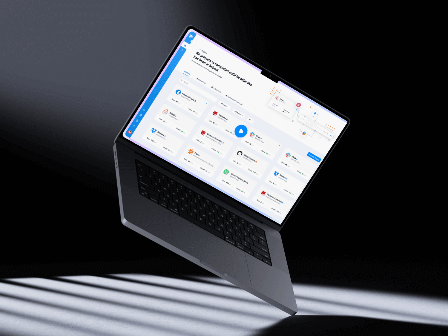
Bugasura is an AI-powered bug-tracking platform for product, engineering, and QA teams. The experience is designed to bring projects, issues, test execution, reports, and integrations into one workspace so teams can understand product quality without piecing together updates across multiple tools.
The challenge
Bug tracking is inherently dense. Teams need to compare projects, filter large issue sets, assign ownership, monitor testing, and identify risk quickly. The design challenge was to preserve that depth while preventing dashboards and reports from becoming visually exhausting.
My role
As Product Designer, I worked on the information hierarchy, dashboard patterns, filtering behavior, issue-reporting workflows, and reporting views. The goal was a system that supports quick scanning for leads and focused action for contributors.
Design Process
The process began by separating everyday triage from higher-level quality monitoring. That distinction guided the navigation, dashboard hierarchy, and reusable components used across project, issue, and report views.
1. Organizing the product around work
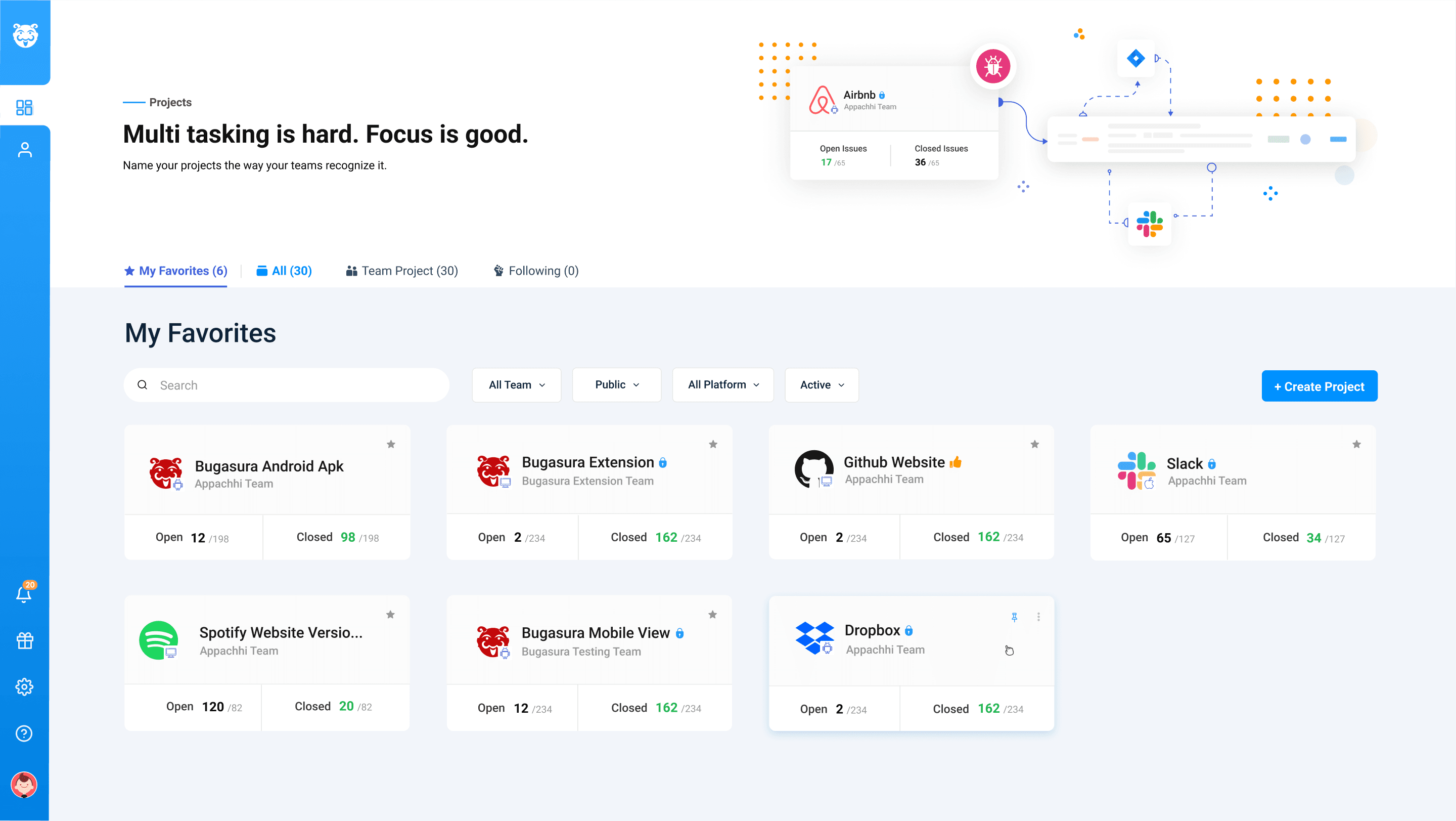
Projects became the primary entry point, with issue status, progress, and ownership summarized before users open a detailed view. This gives teams a stable structure even as the number of bugs and test cases grows.
2. Designing for fast triage
Search, sorting, filters, status labels, and reporter context were treated as core interactions rather than secondary controls. The hierarchy makes exceptions and blockers easier to spot within dense lists.
3. Building a scalable UI system
Cards, status colors, tables, charts, and filter patterns were designed as reusable pieces. Consistent spacing and behavior help users move between project dashboards, bug reports, and test analytics without relearning the interface.
The Solution
Bugasura combines operational detail with a project-level view of quality. The product uses progressive disclosure: summaries answer “where should I look?”, while filters and reports support deeper investigation.
Project-first dashboards
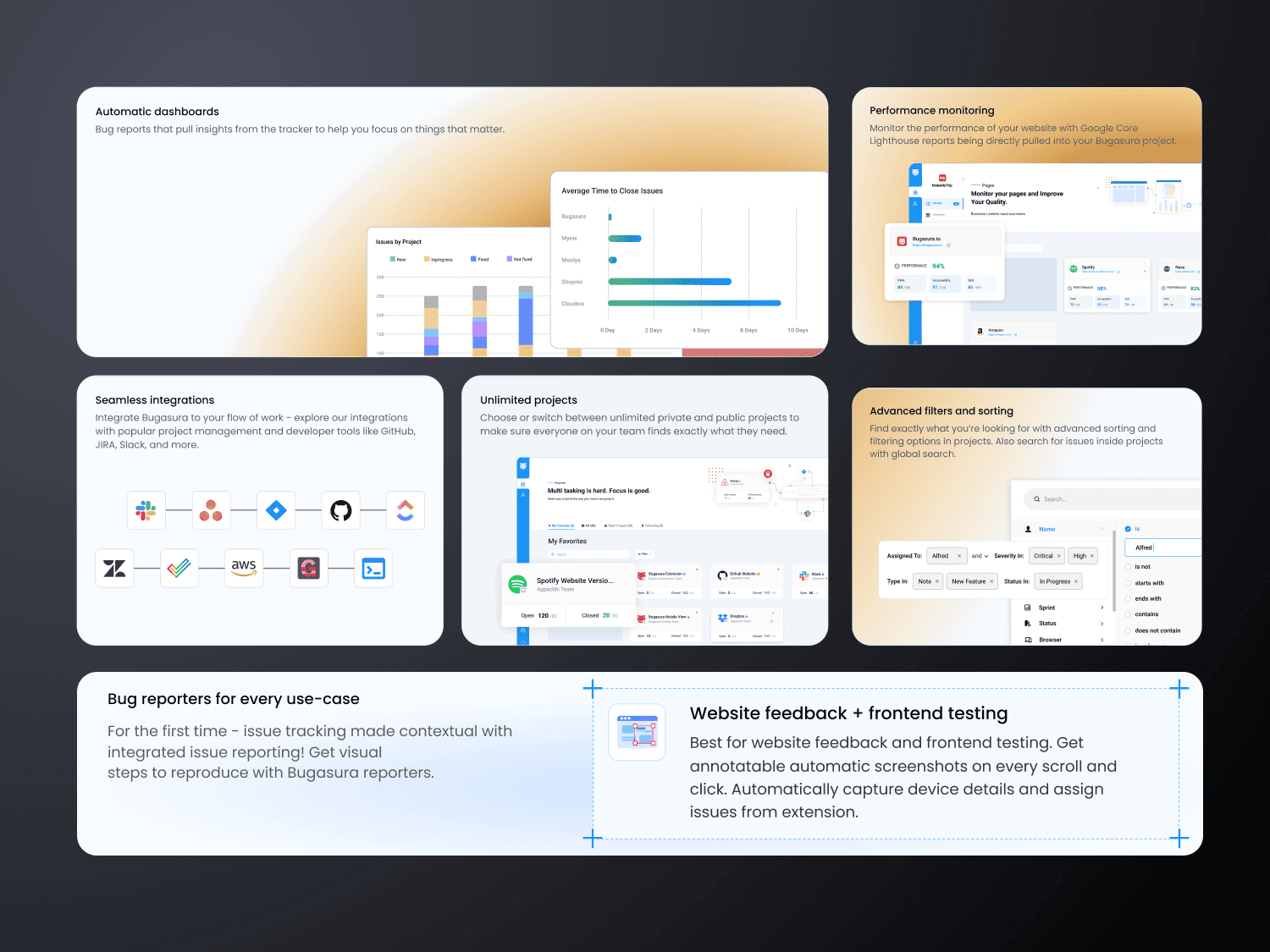
Project cards summarize activity and progress, helping teams move directly to the product area that needs attention. Automatic dashboards reduce the work required to assemble a status view.
Powerful issue discovery
Search, advanced filtering, sorting, and status signals let users narrow a large issue set without losing context or switching tools.
Context-rich bug reporting
Reporter details, ownership, priority, and workflow state stay close to each issue so handoffs are easier to understand and act on.
Testing and reporting in one system
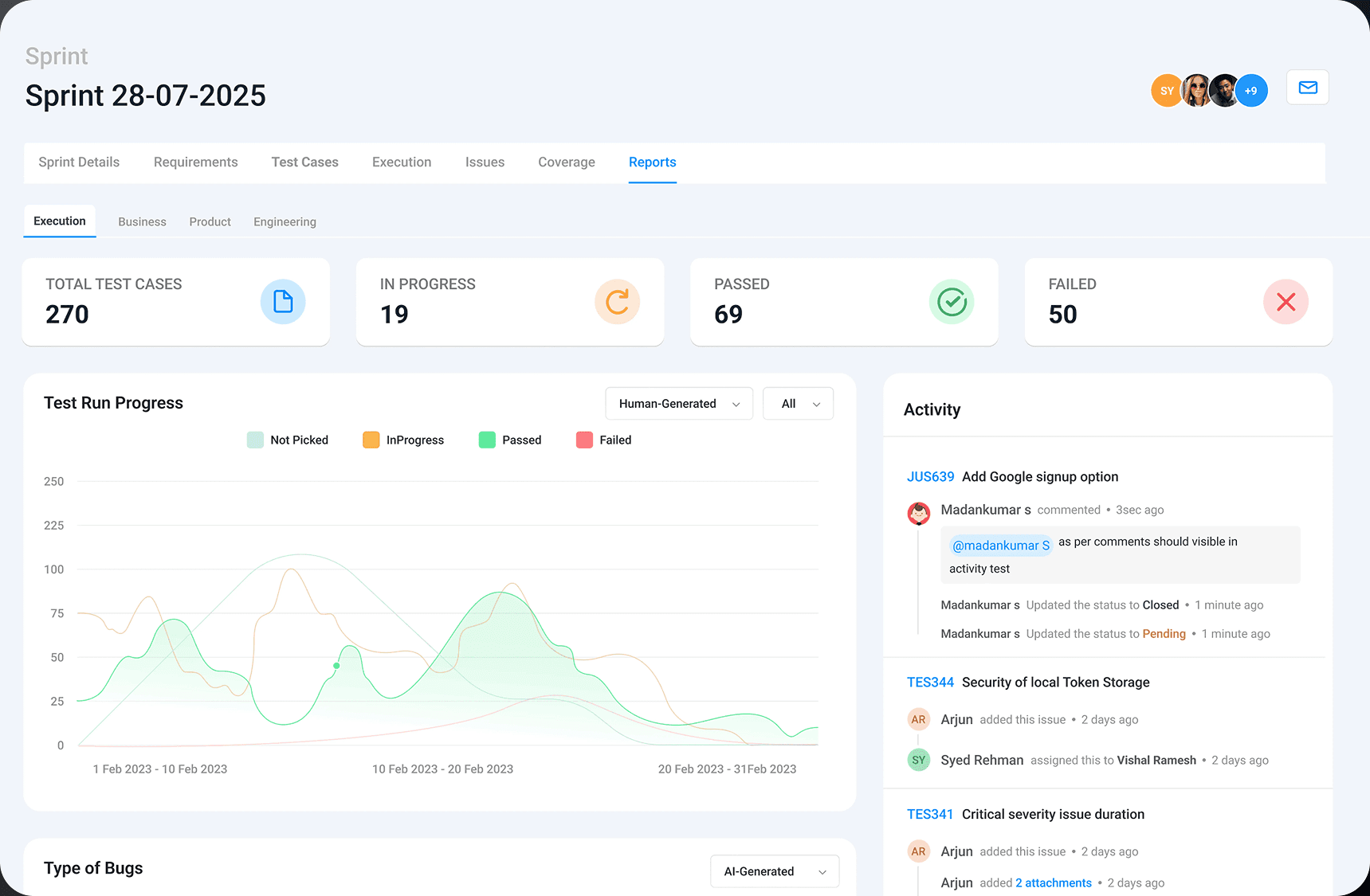
Sprint and test-execution views combine progress, pass/fail signals, activity, and supporting charts, giving leads a clearer picture of release readiness.
Outcome
The resulting product direction creates a clearer hierarchy for a complex QA workspace. Teams can move from a portfolio-level scan to a specific issue or test result while relying on the same visual language throughout.
What the design achieved
Dense information is grouped by decision: project health, issue triage, and test progress. Reusable dashboards and filters make the experience more predictable and give the product room to scale across many projects.
Key learning
Data density is not solved by removing information. It is solved by stronger hierarchy, consistent interaction patterns, and progressive disclosure that reveals detail at the moment it becomes useful.