ARROW
Making Drone Delivery Feel Simple and Trustworthy
COMPANY
PWIP
ROLE
UX Designer
EXPERTISE
UX/UI Design
YEAR
2022
Project Overview
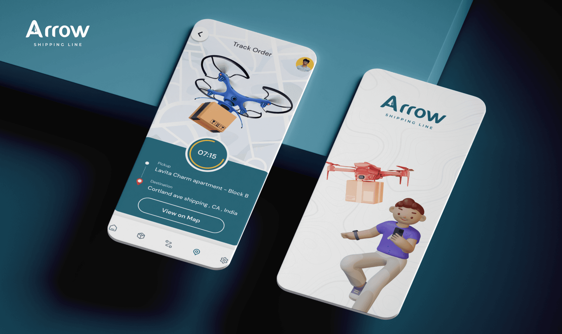
Arrow is a mobile shipping concept that translates drone-based logistics into a familiar customer journey. It brings route selection, package details, cost estimation, live tracking, and billing into one experience designed to feel clear even when the delivery technology is new.
The challenge
Drone delivery introduces uncertainty that traditional courier interfaces rarely need to explain. Customers still want simple answers: Can this route be served? What will it cost? Where is the package now? When will it arrive? The UX had to surface those answers without exposing unnecessary operational complexity.
My role
As UX Designer, I defined the booking and tracking journeys, organized shipping information, and created the mobile interaction model. The focus was trust: every important action needed a visible confirmation, price context, and delivery status.
Design Process
The design process treated booking and tracking as one continuous journey. Instead of separating logistics tools into disconnected screens, the experience keeps route, shipment, cost, and status information connected from quote to delivery.
1. Mapping the shipment journey
I broke the experience into four stages: define pickup and destination, describe the package, review the estimate, and track the active delivery. This created a clear mental model and exposed the moments where users need reassurance.
2. Establishing information priority
Route, ETA, and current status receive the strongest visual emphasis. Secondary details such as bill history and shipment references remain easy to access without competing with the live delivery state.
3. Designing for confidence
Map previews, address summaries, editable fields, and confirmation screens let users verify decisions before proceeding. Teal communicates reliability, while orange highlights actions, movement, and time-sensitive status.
The Solution
Arrow presents drone shipping through a familiar, step-by-step mobile flow. The technology stays in the background while the interface emphasizes cost, route, status, and control.
Route-first booking
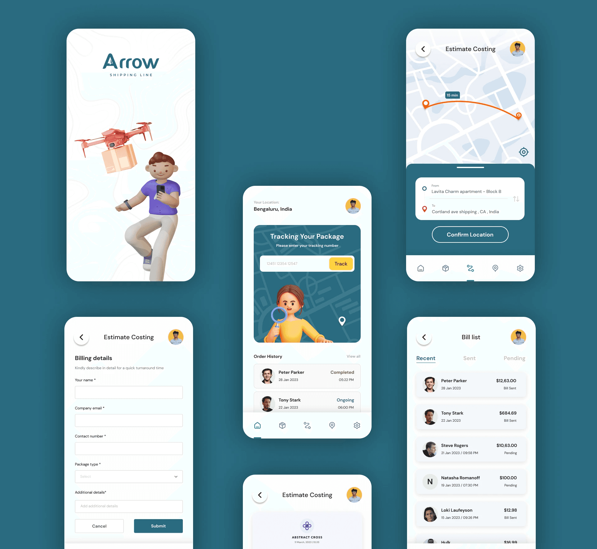
Pickup and destination are established early and shown on a map, giving customers immediate spatial context before they enter package details.
Transparent cost estimation
A structured form captures shipment information and produces a reviewable estimate. Users can confirm the route and cost before creating the order.
Live delivery tracking
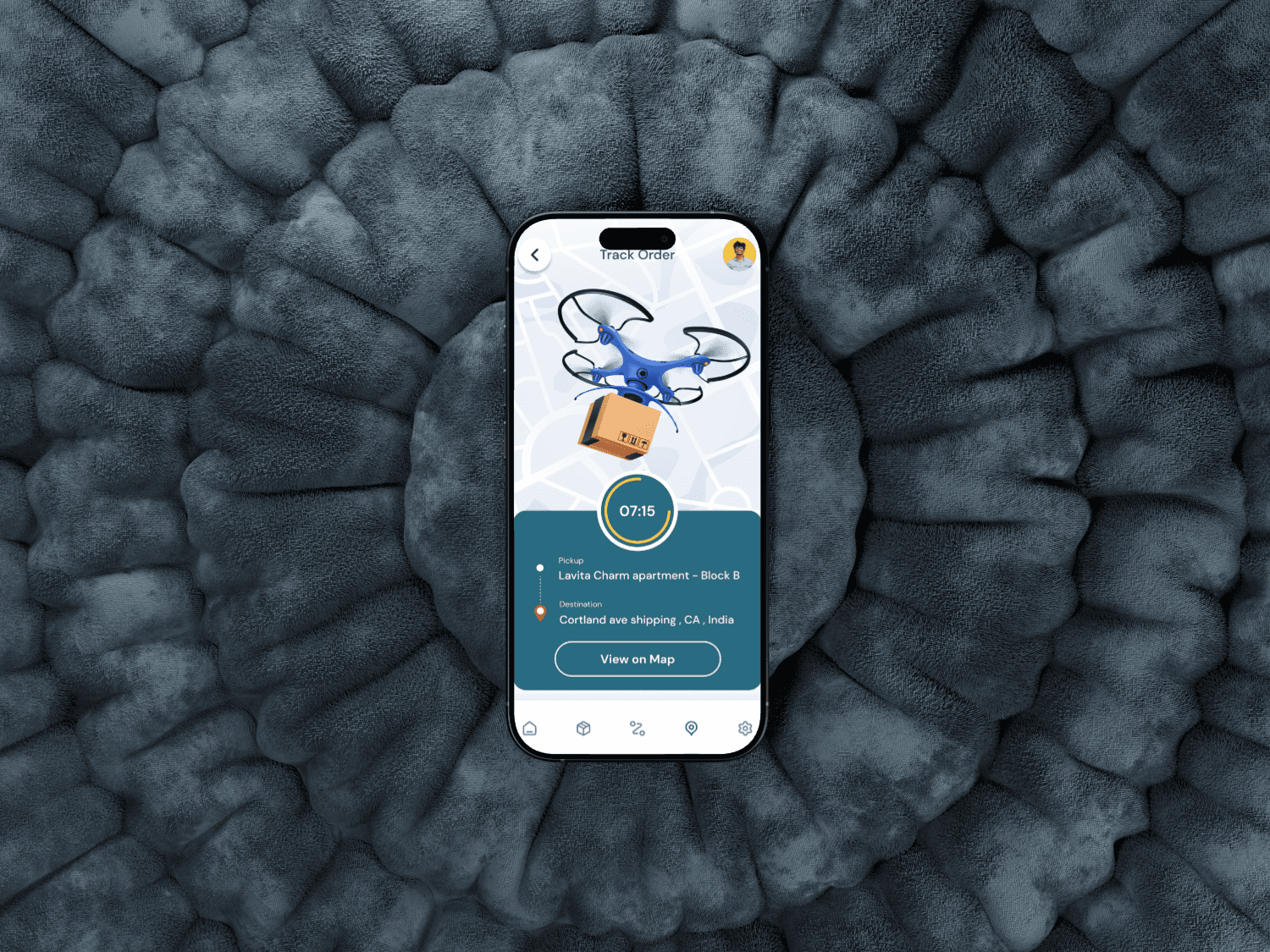
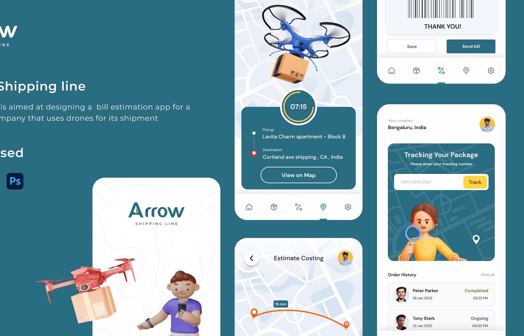
The tracking screen combines the drone’s position, ETA, current status, pickup point, and destination in a single view designed for quick scanning.
Order and billing history
Completed and active shipments remain available through a simple list, making receipts, references, and past delivery details easy to retrieve.
Outcome
The final prototype makes an unfamiliar shipping model feel understandable by reusing patterns people already know from delivery and mobility apps. It gives customers visibility at each step without overwhelming them with the mechanics of drone operations.
What the design achieved
Booking, estimation, confirmation, and tracking now read as one connected service. Clear status hierarchy and route context help build trust in a delivery method that may initially feel unpredictable.
Key learning
For emerging technology, the interface should explain the state of the service—not the technology itself. Confidence comes from timely feedback, understandable pricing, and a visible path to completion.